Showing posts with label photoshop tutorials. Show all posts

MASTER COMPOSITING


CREATE YOUR WORKSPACE
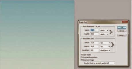
Create a new file 235mm wide by 302mm high at 300dpi. The background will be made using a gradient. Activate the Gradient tool and in the Gradient Editor choose a #e2ebdb colour in one Color Stop and #69adbf in the other. Then drag the Gradient tool line from the bottom edge to the upper edge.


SELECT THE MODEL
First, select a model of your choice from any photo stock site. Open the Channels panel and select Blue. Ctrl/right-click then duplicate this. Go to Image>Adjustment>Levels and make a small adjustment to increase contrast. The main goal is to keep edges of the hair and not cut them off. Go to Image>Apply Image, choose Blending: Overlay.


PAINT TO YOUR CHANNEL
Paint the model with a black brush and the background with a white one, using different sizes of hard brush. Keep edges as they were in the original image. Cmd/Ctrl-click on the duplicate thumbnail and create a selection of all black areas. Turn on the visibility of the RGB channels and open the Layers window. Drag the model into your working file.


TRANSFORM ELEMENTS
Go to cgtextures.com, then search and download the large sized 12107 grass file. Drag this into your working file. Press Cmd/Ctrl+T, then Ctrl/right-click a control point and choose Perspective from the pop-up options. Narrow the upper control points then, without pressing enter, Ctrl/right-click again and choose Distort. Click the upper-middle point and lower it. After this, choose Warp and adjust like in the example presented, using points to create Bézier curves. Your goal is to make a curved surface.


  ADD PEARLS
Open ‘Pearl.psd’ and drag the layer into your image. Cmd/Ctrl+J to make a few duplicate layers of this. Use Transform to resize your layers and arrange on top of the grass layer, making sure that the bigger ones are closer and smaller ones further away. Use the Polygonal Lasso tool to select grass shapes and duplicate these from the grass texture layer. Place these new cut-out layers above your pearl ones. Add Layer>Layer Style>Inner Shadow to the biggest pearl layer, setting Opacity at 75%, Angle at -75 degrees, Distance at 20, Choke at 0 and Size at 109.


♦ QUICK TIP
Shade objects in your images more easily by working to a new layer Always place this directly above the one you want to edit. For better results, always lay your shadow marks with a Multiply blending mode. Also, before you start painting, load a selection of the layer below, then press Cmd/Ctrl+H to hide it.


ADD FLOWERS 
Go to CG Textures and download the 24670 flowerbed file. Use the Pen tool to make a selection of your flowers, then drag them into your image. Since two flowers bushes are needed, duplicate your new layer and reposition the duplicate using the Transform tool. Now apply colour corrections. Select Image>Adjustment>Levels and input the following values: 0, 2.00 and 220. Apply a Hue/Saturation layer, setting Saturation at -50. Finally, apply a Color Balance adjustment layer at +8 , -31 and -28.


DECORATIVE THORNS
Create thorns by adding the Pen Path tool to a new layer. Select a 30px hard white brush and in the Paths panel, Ctrl/right-click your path thumbnail. Select Stroke with Simulate Pressure deactivated. Choose Select>Load Selection and use a soft brush at 15px, with Always Use Pressure For Opacity activated from the Brush options. Add shadows to the edges of your line, using a #b7b7b7 coloured brush on a new layer. Open ‘Thorns.psd’ and paste them in, arranging them on the stem you’ve created.


ANIMAL COLLAGE 
Open the ‘Fawn.psd’, ‘Yellow Rose.psd’ and ‘Horns.psd’ from the disc. Select and drag them into your working image. Activate the Fawn layer and apply Color Balance, setting values to +48, -22 and -36. Activate the Horns layer and again add Color Balance, setting values to +66, -63 and -34. Create a new layer beneath your Yellow Rose layer and apply a #977166 colour to create a shadow. Do this by applying a soft brush with the Always Use Pressure For Opacity option active.


CREATE ARROWS 
Make the body of your arrows by applying a selection with your Rectangular Marquee tool and filling this with a #404040 colour. Add an Inner Glow Layer Style and set Blend Mode to Screen, Color to #c3a87c, Technique to Softer, Source to Center, Size at 29 and Choke to 18. Use the Pen Shape tool to create arrowheads, adding a #3f3f3f to #5e5341 colour gradient overlay. For the fletchings, download the 107167 branches file from CG Textures and change it to red using colour adjustments. Merge the layers and duplicate, then place in the model’s hands.


CREATE A MASK
Use the Pen tool to draw a path that follows the contour of the face with horned extensions. When closed, make a selection of it, add a new layer and fill it with white. Apply shadows to edges to create a 3D effect using a #b7b7b7 coloured soft brush, with the Always Use Pressure For Opacity option activated. Before you start painting shadow, you need to load a selection of the mask, then make a new layer above. Paint to this with a soft brush, creating shadow. Apply Gaussian Blur at a 4px radius, while your mask selection is still active.


HORNS
Creating the horns is a similar process to the mask. First, draw these out using the Pen tool. Then make a selection of the horns and fill this with white in a new layer. Add a Bevel & Emboss Layer Style and set Style to Inner Bevel, Technique to Smooth, Depth at 276%, Size at 13, Soften at 13, Shadow Mode to Multiply, Color to #77979e and Opacity at 38%. Everything else is set to default. Open the ‘Flowers.psd’ supplied on disc and drag this into your working image. Place and transform to build the best look.


WHITE PARTS
Now you will continue to add what looks like bits of porcelain to the model’s skin. First, make use of the Pen tool to make a selection as before, then press Cmd/Ctrl+J to duplicate a skin section. With this duplicated layer selected, go to Image> Adjustment>Desaturate. Load a selection of this shape and apply Gaussian Blur set at a 10px radius. Deselect (Cmd/Ctrl+D) your selection, duplicate this layer twice, then merge all three layers. Go to Levels and input the following values: 15, 1.18 and 228. Apply shadow below the objects using a #926958 coloured brush applied to a new layer set to a Multiply blending mode.


TREES
Trunks can be made with a #c9c9c9 coloured hard brush. A #767676 coloured soft brush is added to
create shadow in the middle of the trunk. Change your brush group to Dry Media. Pick a Soft Oil Pastel brush with a #767676 colour and add lines of varying sizes to the trunk. Download the 55089 trees image from CG Textures and select only the treetop, dragging it into your image. Apply Levels set to 0, 1.88 and 245. Now add Hue/Saturation, setting Saturation at -25. Finally, add Color balance, setting values at 100, 0, +100.


GLOWING EFFECTS 
Open the ‘Bird.psd’ file from the disc and drag it into your working image. Create a glow effect behind your model using the Elliptical Marquee tool. Before making your selection, set Feather at 200px. Apply to your background layer and press Cmd/Ctrl+J to duplicate. Add Levels, setting values at 0, 2.08 and 255. Add Color Balance, setting values to 0, 0 and 100. Duplicate your pearls and arrange them at different sizes, floating at the top of the image. 

IMPROVE THE MOOD 
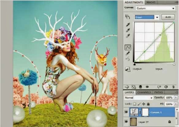
To improve mood and connect the elements together, apply textures and adjustment layers. Open ‘Texture.jpg’ supplied on the disc and drag it into your working image. This layer needs to be above all other layers. Set its blending mode to Soft Light. Add more contrast using Layers>New Adjustment Layer>Curves. Select the Green curves channel and add a slight upwards curve to affect the image colour. See the position in the screenshot below.


     IMPROVING GENERAL ATMOSPHERE
Applying textures and layer adjustments is
important, as these tighten up the image and
make all elements look as if they belong in the
same space. Very often an image looks too raw.
Vignette effects in particular focus all elements in
a single space, making the whole image less flat.
Layer adjustments can work to create some
exciting effects, but first and foremost their main
concern is with creating colour harmony, existing
throughout all your layers.


 SETTINGS
After changing the overall colour and mood, it’s time to polish your image and review all image elements. To make the model’s hair brighter, use the Dodge tool with Exposure set at 70% and pass over this area and darker parts of the dress. To make the model closer to her environment, apply Levels with input set to 0, 1.18 and 255. The grass also looks too dark, so apply Levels with input values set to 0, 1.35, 241. Set output to 11 and 231.


SHADOWS
Adding shadow defines your main light source much better. The most important shadows exist in the grass layer. Choose a #979842 colour and create a new layer. Select a soft brush set to Always Use
Pressure For Opacity and paint in shadows beneath the model, pearls and trees with varying brush sizes. The model’s shoes also need to be darker, so use the Eyedropper tool to choose a darker tone from these. With the same brush settings, make the lower part of the shoes darker.


SUN RAYS
These illustrated sunrays are made in Adobe Illustrator. In a new file, make one straight line with a 1pt stroke. Select Effect>Distort and Transform>Transform. Change Scale/Vertical to 109%, make 40 copies and set Angle at 124°. Turn colour to white and drag objects into your image. Resize this new vector layer then Rasterize it (Cmd/Ctrl-click layer> Rasterize layer). To avoid sharp ends in your lines, apply a soft brush Erase tool and erase the tops of these with one click.


♦ QUICK TIP
Take care of light and it will take care of the rest, making your image much more convincing. All newly imported images and elements need to be edited so that they follow one light source.

DESIGN YOUR OWN CHARACTERS


CREATE A NEW CANVAS
First, you’ll need a brand new canvas. Start by creating a document by going to File>New and create a canvas that is 210mm x 148mm, and at 300dpi. It’s better to keep the canvas rather small at this stage so that you can pay attention to the whole of the image. Fill the background layer with a light-grey tone. It’s often better to work on a darker canvas, since it’s more comfortable for your eyes. Then create a new empty layer on top – that’s the layer you’re going to sketch on next.


It’s often better to work on a darker canvas, since it’s more comfortable for your eyes


THE VERY FIRST THUMBNAILS
Start by quickly putting down a bunch of thumbnails. Keep them small and pick a mediumsized brush that you feel comfortable with. This is the ‘sandbox’ phase, and any idea is allowed at this stage. Focus on experimenting with pose, composition and proportions. The position of the little thumbnails is not that important, just make sure that you get every single idea out of your system. Stay very loose and feel free to play around a lot before settling entirely with your idea.


CREATE A ROUGH SKETCH
Pick the thumbnails that are closest to your idea and start arranging them on your canvas. Lower the opacity of that layer and create a new one on top of it. Keep sketching until the entire image works, and keep experimenting. It’s great to constantly ask yourself questions such as: What’s the purpose with the image? How does the story go? Which moment works best for this illustration? What style should it have? Who’s the audience? Does the composition direct the viewer properly?


REFINE THE CHARACTERS
Now you will need to create another document to implement your final design. Feel free to make it even larger this time and fill the background with a light-grey tone. Select the character sketch with the Lasso tool from the rough sketch, copy the selection and paste it into your new document. After that, scale the characters so that they fill out the whole canvas and lower the opacity of the layer, then create another empty one and start refining the sketch further. To do this, use a brush with hard edges, and with the opacity settings activated.


LOWER THE OPACITY
When the characters are more refined and you feel happy with them, copy the layer and add it to the previous sketch document. Remove the rough version of the characters and merge the sketch layers together. The sketch should only work as a vague guideline for the painting itself, so lower the Opacity to about 30% and lock that layer. Most of the other layers (except some adjustment layers that affect the entire image) created for this painting will stay underneath the line drawing.


TRY IT OUT IN GREYSCALE
It’s time to play around a bit with the values. Block everything in with flat tones just to find some suitable values that will work well with the composition and mood. Paint on a new empty layer that’s created underneath the sketch layer. A nice rule to go by is that if things work well in greyscale, then it will definitely work out in colour as well later on. In general, it’s also nice to have several possibilities to choose from before you start to colour a new piece.


COLOUR TEST
Before getting too serious with the illustration, it’s a good idea to quickly flatten the greyscale sketch and create and save a new version that will serve as a colour palette later on. On the new document, create a new empty layer and set the layer blending mode to Color. Now you can start painting some colours in without affecting the tones. This one will work well with lots of greens as the dominating hue, with a slight touch of brown, yellow and red. 


♦ QUICK TIP
This shortcut that can be created through Actions is very handy when painting digitally in Photoshop. Simply create an Action that flips your canvas horizontally when pressing a specific key, perhaps F2. Flipping your canvas often makes you look at the painting with fresh eyes, and you can immediately see and fix any proportions or compositions that may be a bit off.


BLOCK IN THE BASE COLOURS
After settling on a nice colour scheme, it’s time to block everything in. This will make things so much easier when starting to paint the illustration. The base layers can be created using the Pen tool. Start by drawing the main shape to create a new path, then make that path a selection and fill it with a basic colour. Proceed by creating basic shapes for the different background elements, the wolf and the girl. Lock the transparency of each layer when done.


CREATE CLIPPING MASKS
This stage really is a true time-saver, and it’s one of my favourite Photoshop shortcuts. Start by creating new layers on top of each ‘blocked’ layer, then press Opt/Alt and hover the cursor in-between the two layers. The lower layer will become the parent of the upper one, and it will then stay within that shape, no matter how messy you paint. It also means that you only need to block in the main parts once. You can then focus on the fun part – the painting itself!


When all the base colours are added to the painting and you’re all set, it’s helpful to create a Hue/Saturation adjustment layer. Keep it on top of the entire painting and adjust it so that the painting gets completely desaturated. You can then turn this layer on and off to keep checking the values when painting. Is the painting readable in greyscale at this stage? Good! Then it’s ready to get painted for rea.


TIME TO PAINT!
Keep blocking in base colours with a large brush. The basic brushes will work perfectly at this stage. Use big, bold strokes in the beginning and switch between hard-edge and soft-edge brushes, keeping the Opacity at 20-50%. Stay loose and always work on the entire painting. To get a better overview, open the document in two separate windows using Window>Arrange>New window.


FLIP YOUR CANVAS REGULARLY
Go to Image>Image Rotation>Flip Horizontally on a regular basis to check the proportions, balance and composition. When you flip the canvas, you’ll see immediately if the nose looks off, or if the position of the eyes is awkward. It’s a lot easier to spot mistakes. The great news is that you get to make the changes in time. If the image is working in both angles, then it’s probably balanced.

001
Decide on the direction of your light source and paint highlights accordingly. Feel free to stay a bit loose
002
Now that the image has been flipped, you can check that the composition is still well balanced
003
Take a step back and think about which parts of the characters need some extra work, like the fur and eyes
004
Start with slightly rendering the form of the characters and tree trunk, keeping the direction of the light in mind


♦ QUICK TIP
It’s always a good idea to keep your light sources on a separate layer to your base image. This way, you can turn those layers off when you need to, and you can then focus entirely on rendering form and putting down those basic values in your painting.


ADD SOME LIGHT
It’s a bit dark here, isn’t it? To solve this, create new layers for the background and the characters, then connect them to the layers underneath as clipping masks. Set the layer mode to Color Dodge and pick an orange midtone to paint with. Use a hard brush without any opacity settings and paint in highlights, ensuring they are in keeping with the direction of the light source. Let those layers stay rough for now, as long as it looks good overall.


 THIRD PAINTING PASS
The image is now ready for some slight detailing and early polishing. Play around with different textured brushes to get that traditional, painterly feel. Safadi’s custom brushes will suit perfectly for this phase. Vary the opacity of the brushes to gain full control while you paint. Create new empty layers on top of the parenting layers if you feel unsure and want to redo, or remove unnecessary changes as you paint.


Turn on the Hue/Saturation adjustment layer that you placed at the very top and check the values. Is the illustration still readable? This part is really crucial, and as mentioned earlier – if it’s working in greyscale, then it will most likely work in colour as well. So it’s a very good habit to just double-check your illustration on a regular basis while working with colours. I can’t encourage this part enough. Is it still working? If it still reads well, then it’s fine.


REFINE THE FUR
You can see that the wolf’s fur needs some more details. Keep painting with a medium-sized brush and render the forms a little bit more. After that, pick a brush that feels more like a traditional brush that slightly imitates hair or fur. Having photo references is always a huge benefit; so don’t be afraid to search for some nice photos that clearly show what a wolf’s fur really looks like. References will always be important, even if you paint in a rather cartoon-like style.  


FURTHER DETAILING
Keep adding in smaller details where they are needed. Paint them all in while keeping a careful eye on the entire illustration. Remember: less is more. Another good thing to keep in mind is to spend some extra time on characters’ eyes and faces in general. These features are one of the first things that the viewer looks at, so it’s important that the eyes and expressions read well and show clear emotions. Getting this part right definitely helps to tell a story. 


References will always be important, even if you paint in a rather cartoon-like style


FINAL TOUCHES
Finally, you can add the smallest and finest details to the painting. These include the whiskers, hair
and sparkles in the eyes. Evaluate the entire painting by flipping the canvas horizontally as in Step 12, turning the Hue/Saturation adjustment layer on to check values once again, and last but not least, make sure that it reveals your story. You can also flatten the entire painting at this stage, so you don’t have to handle all the different layers anymore.


PREPARE FOR DELIVERY
Since this was made for a magazine, it’s good to make sure that all the settings and modes are correct. To start with, check that the image is scaled or cropped properly. Most publishers handle their images in CMYK, so make sure that it’s converted. You can also sharpen the image a bit. Go to Filter>Sharpen>Unsharp Mask. Play with the settings and make sure that the image looks nice and crisp, and then you’re done! Hope you found this tutorial helpful. Good luck!